
Translating Stories
Through Design
For my capstone I designed a bilingual (English–Spanish) book that integrates narrative, imagery,
and typographic exploration to enhance storytelling and create an engaging reading experience where design mirrors literature.
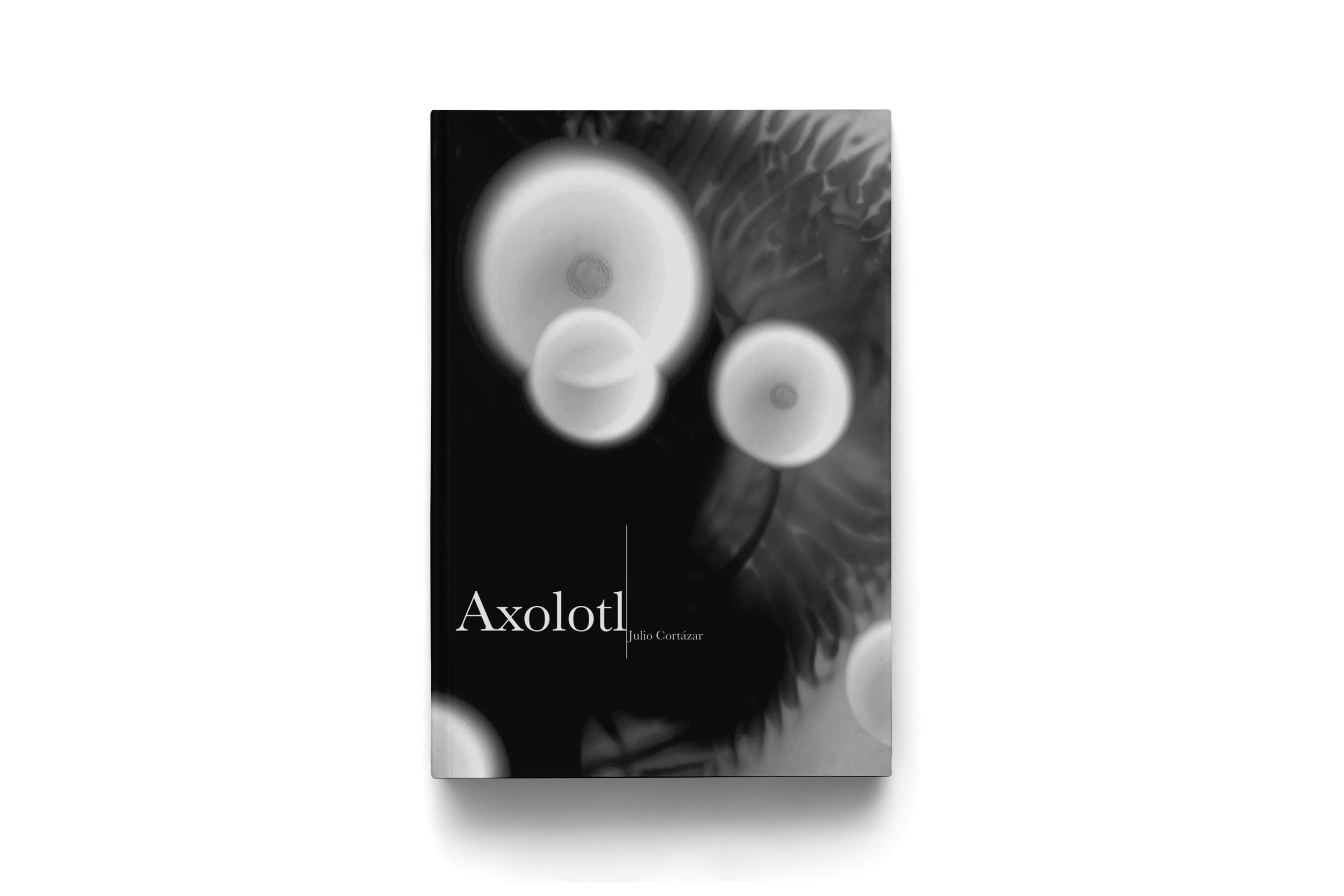
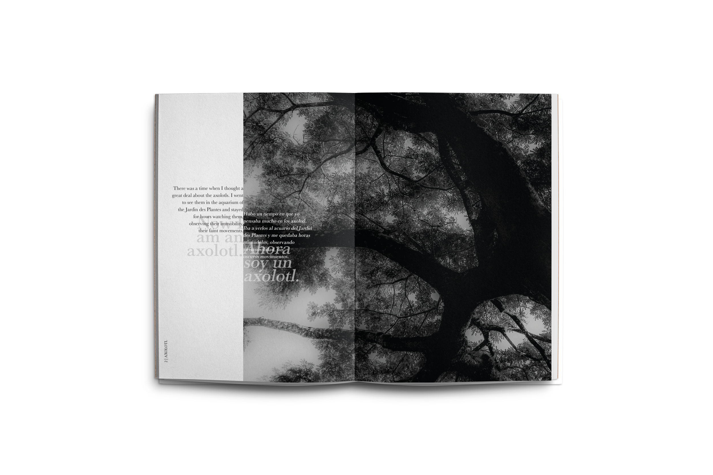
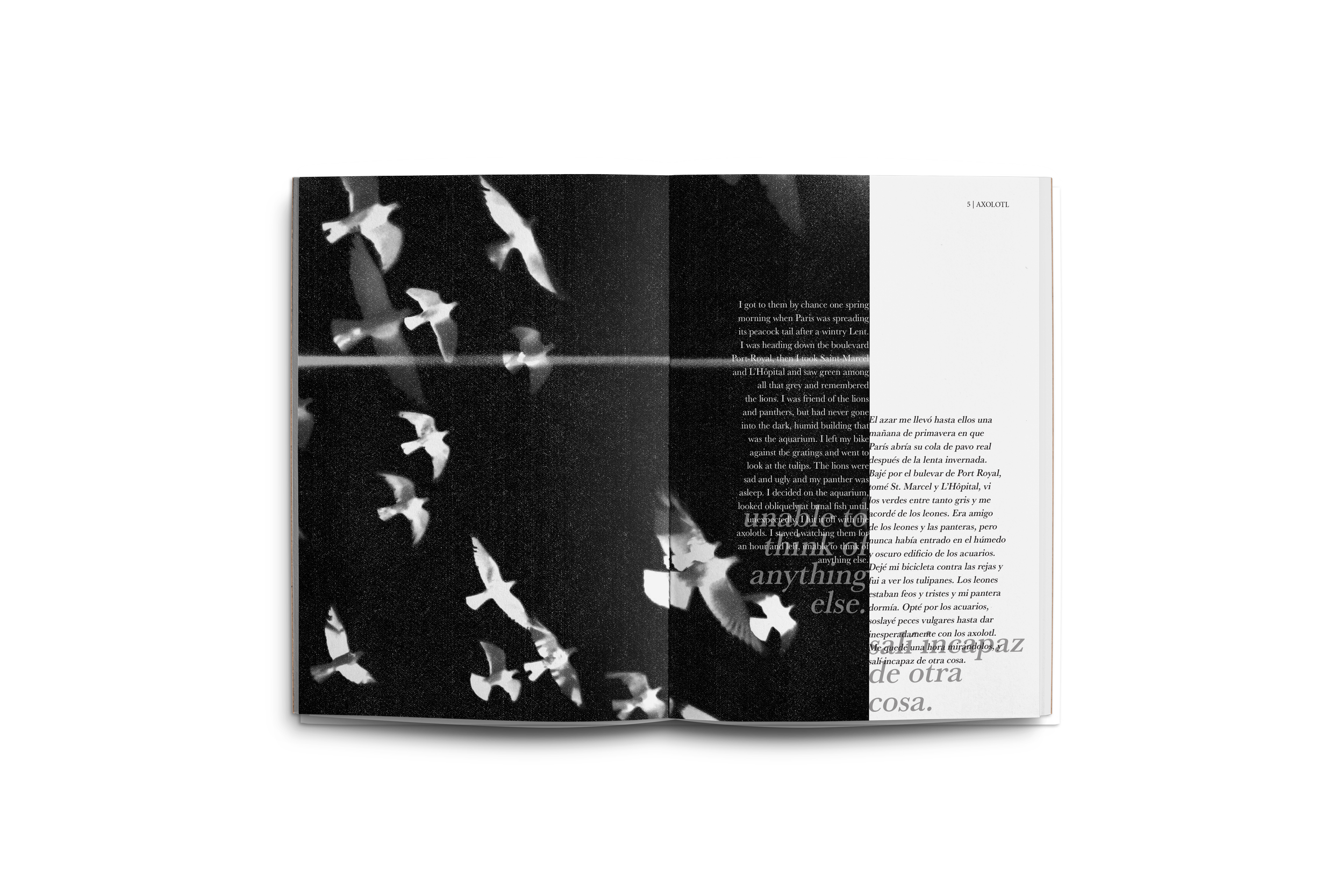
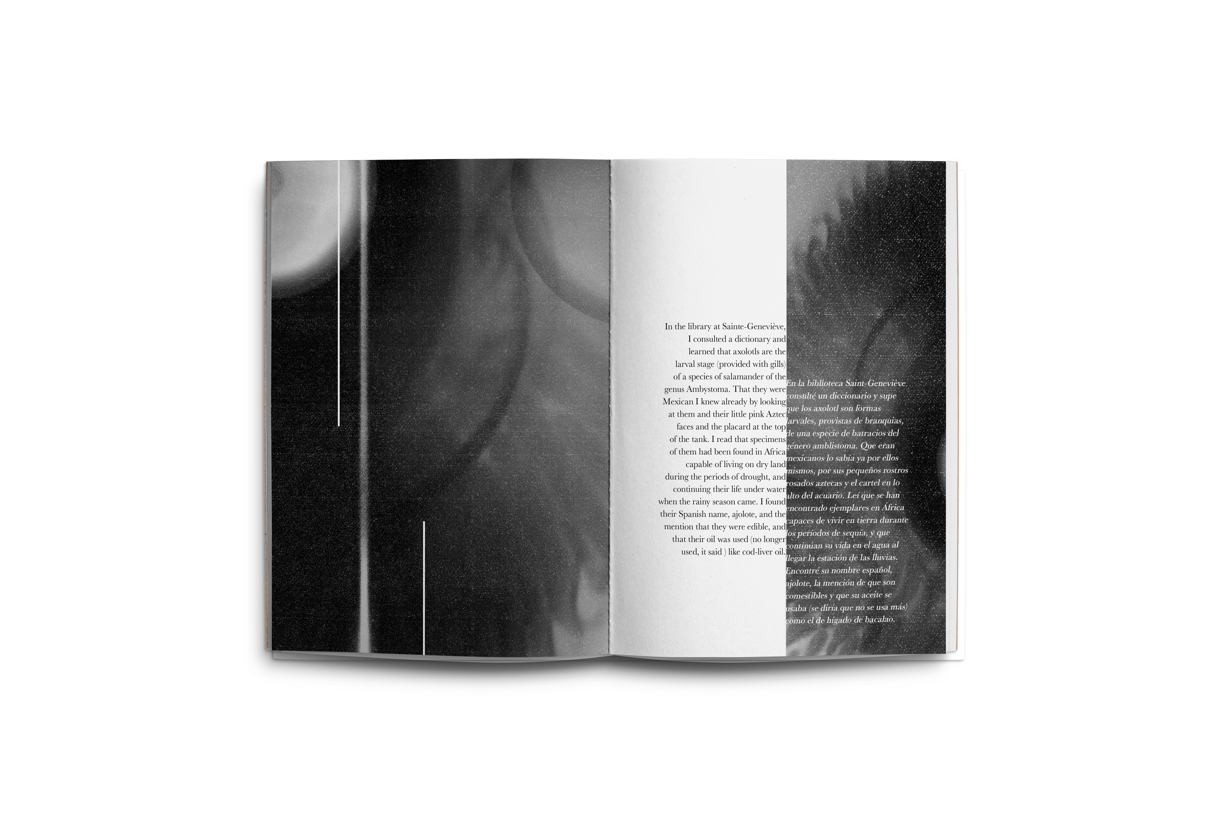
“Axolotl”
by Julio Cortázar
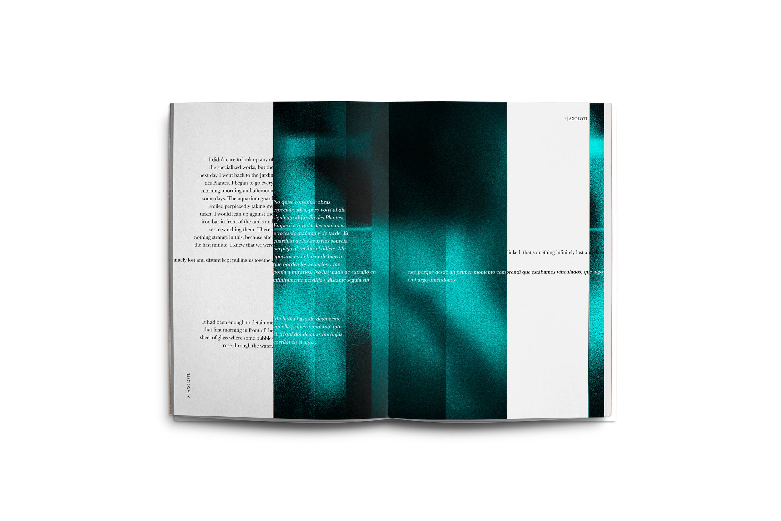
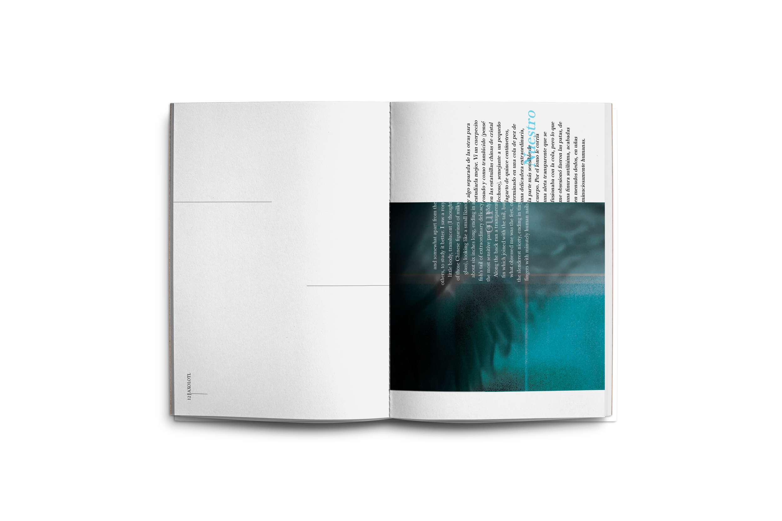
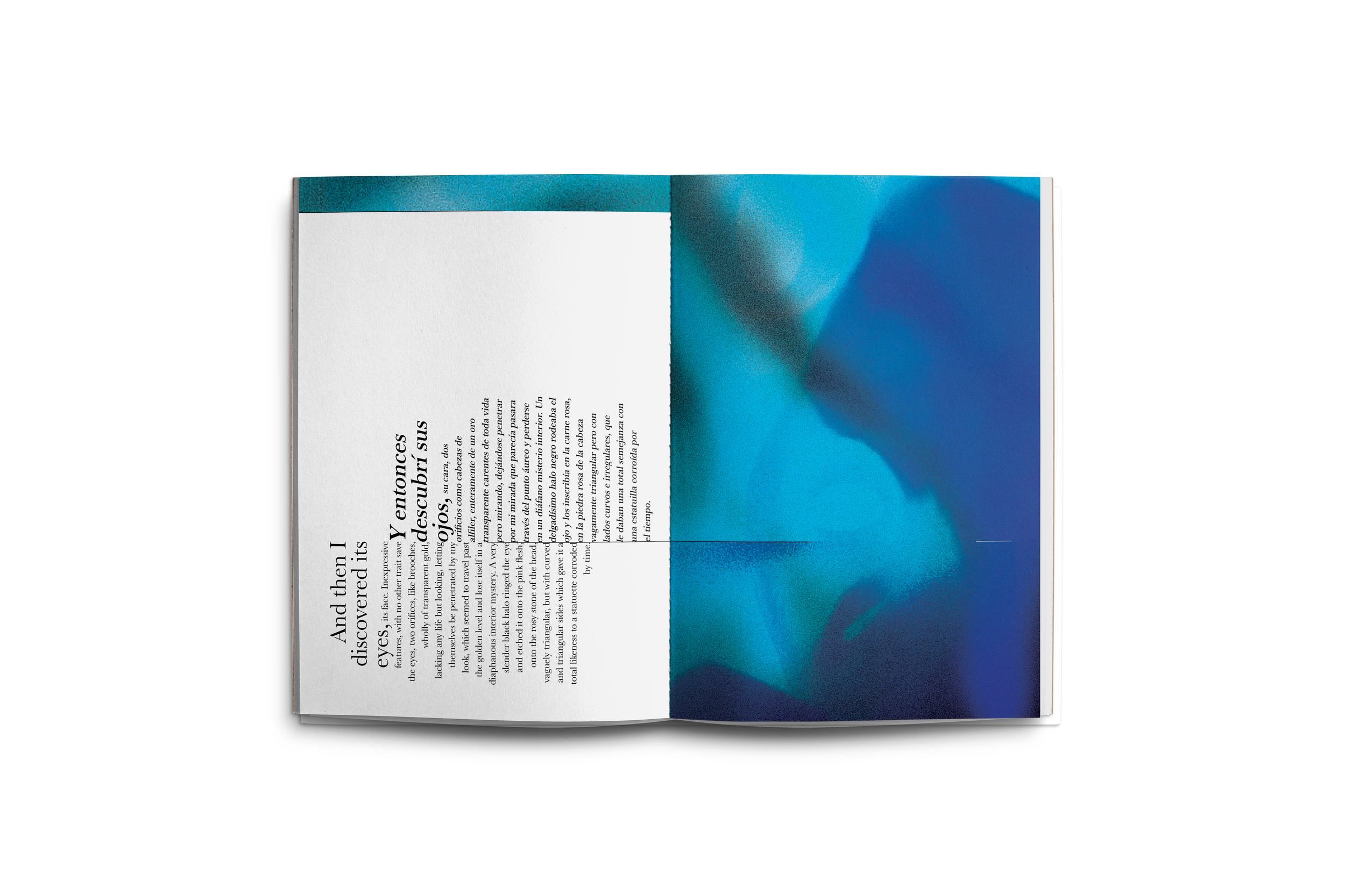
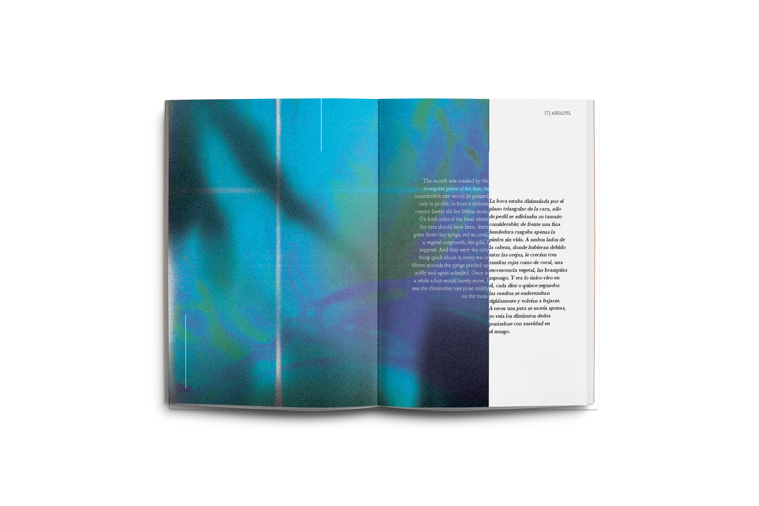
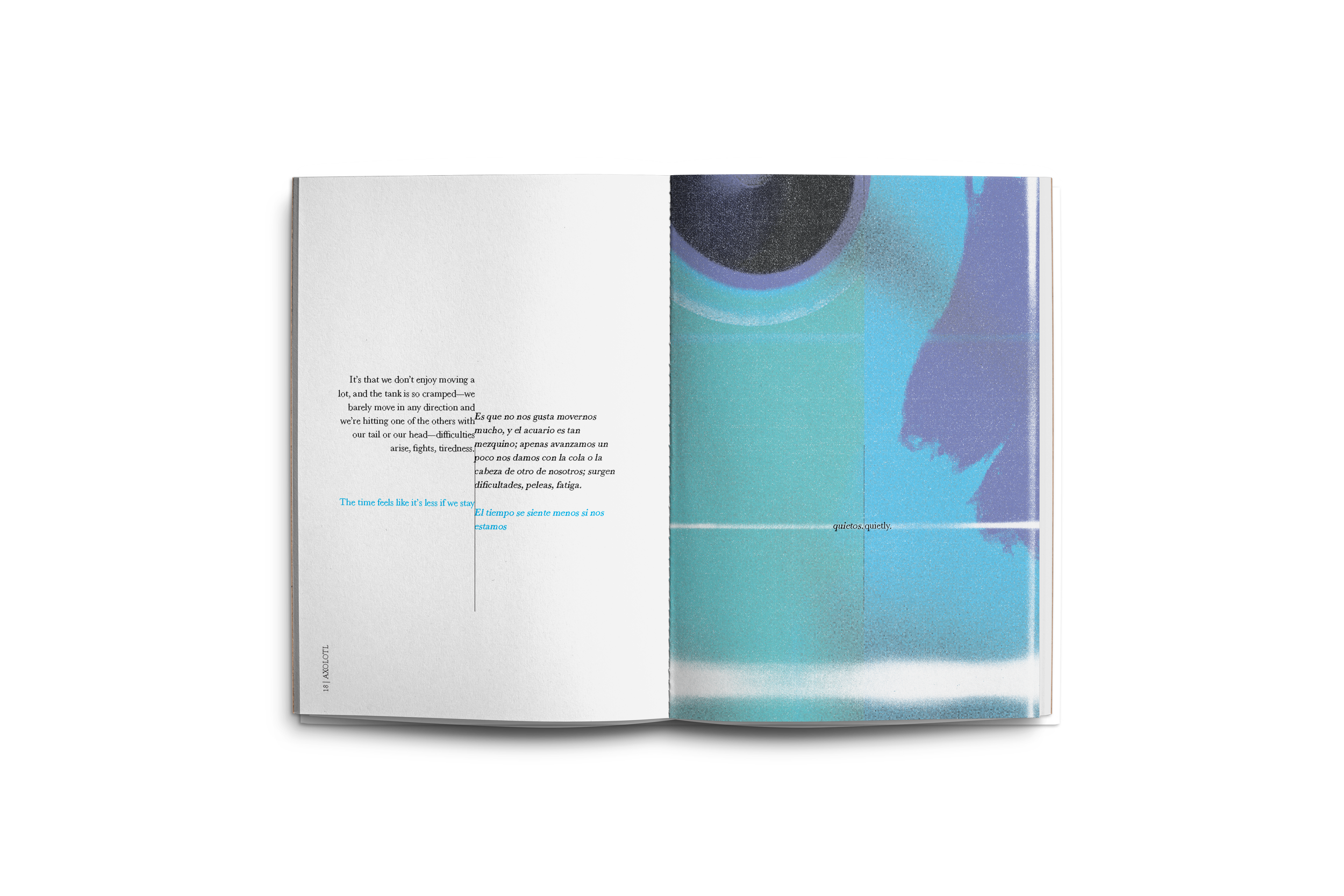
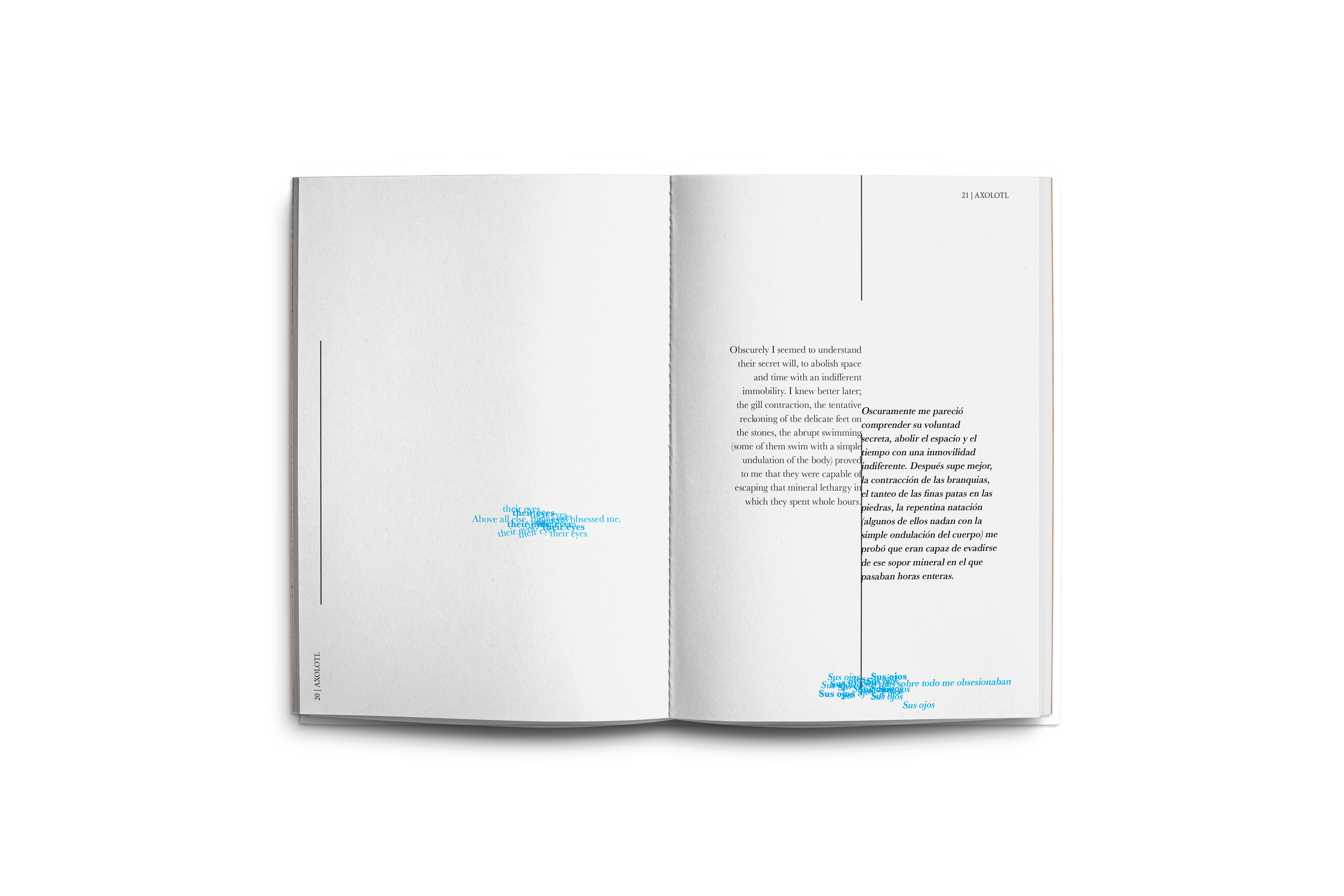
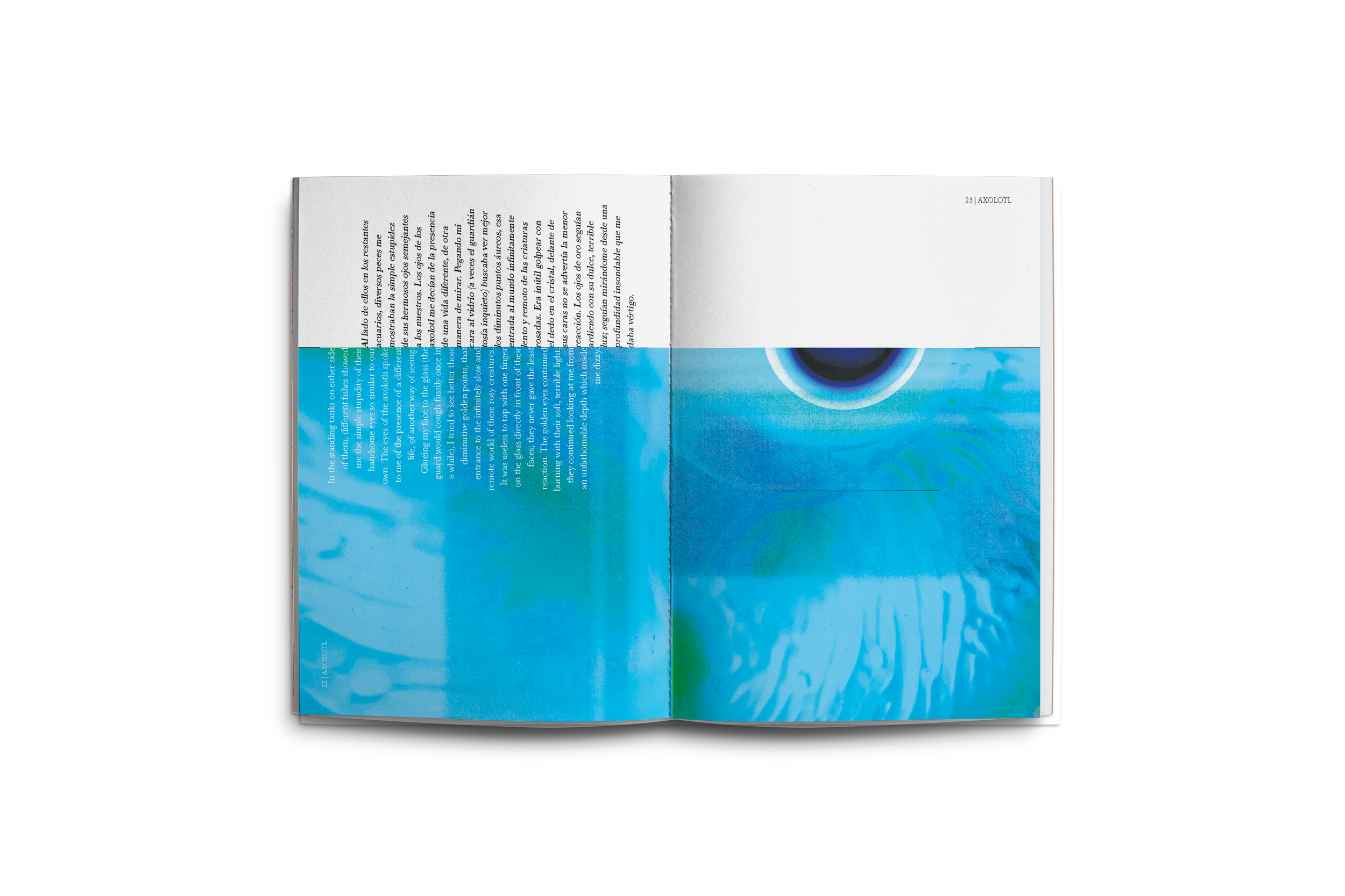
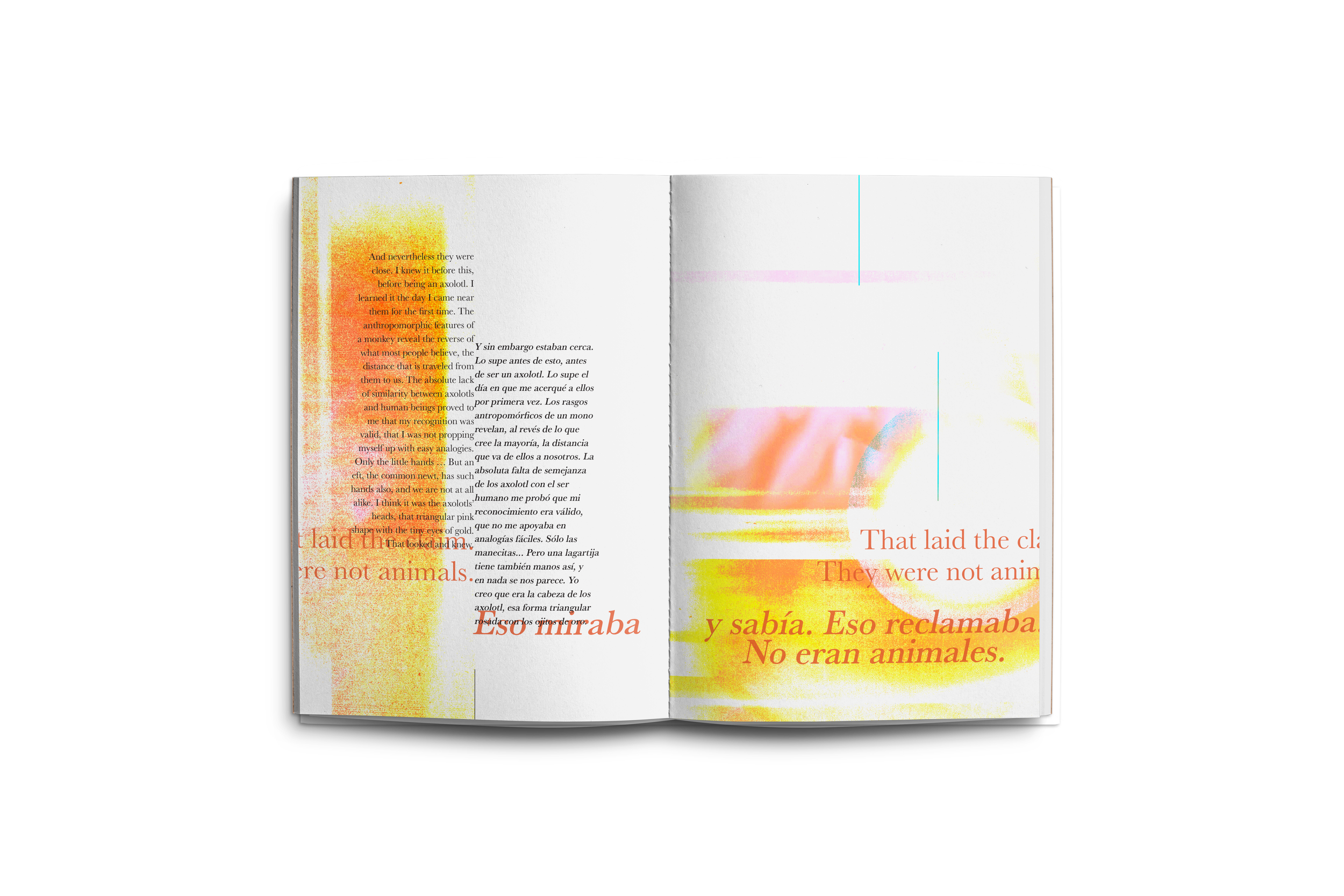
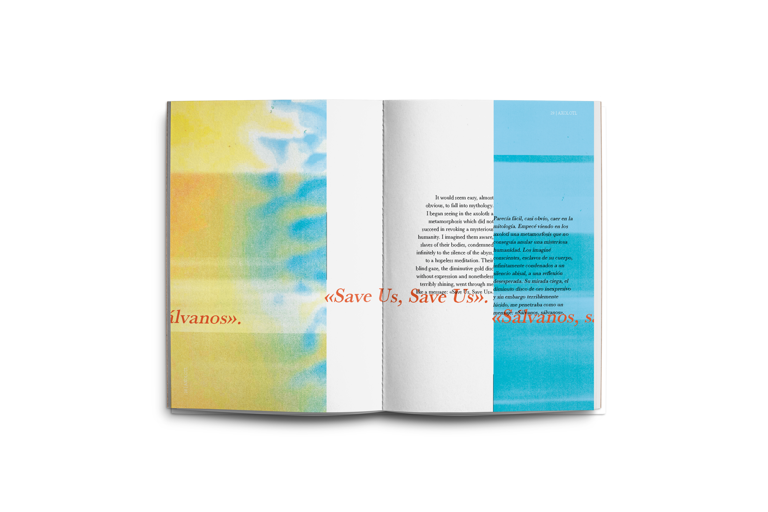
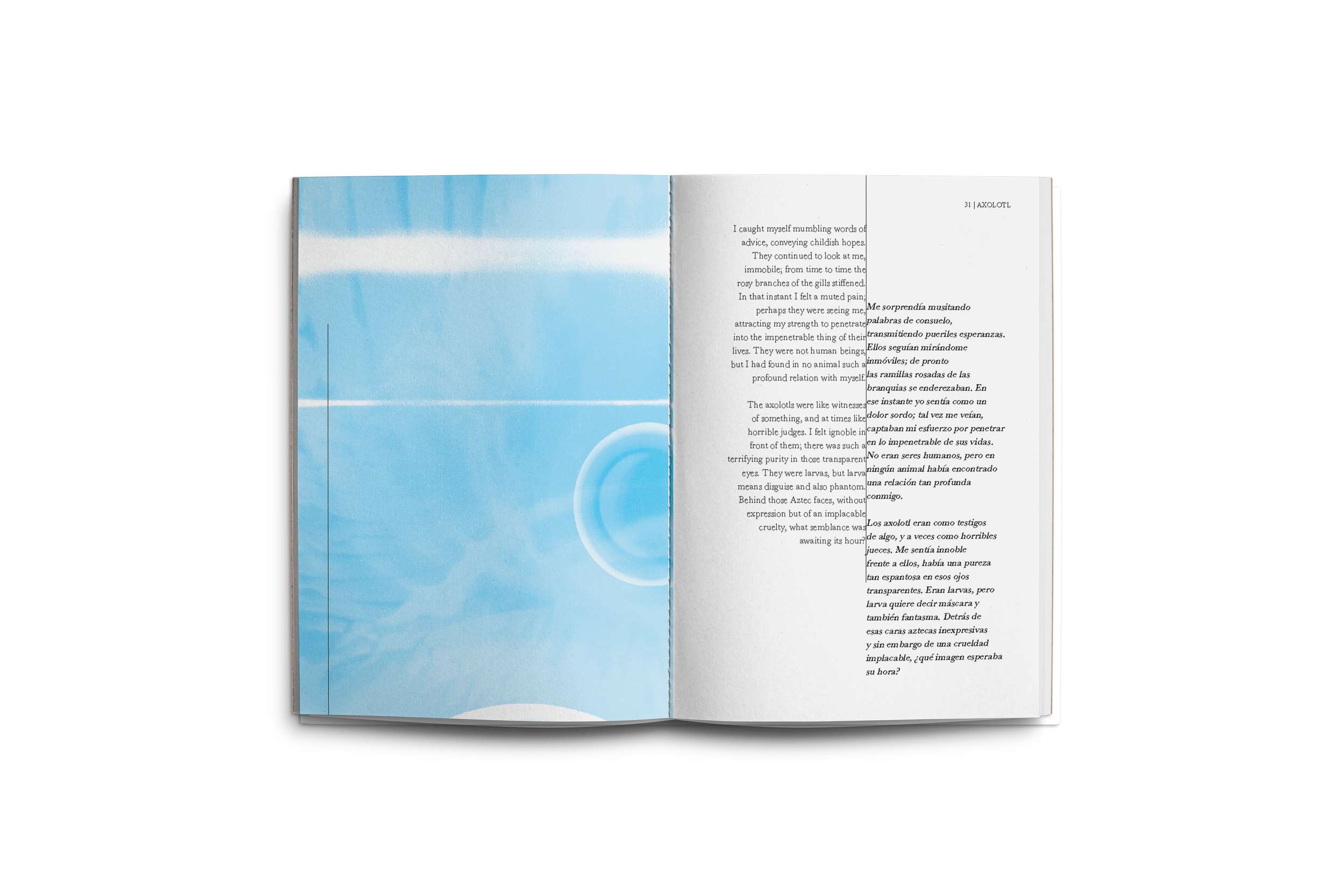
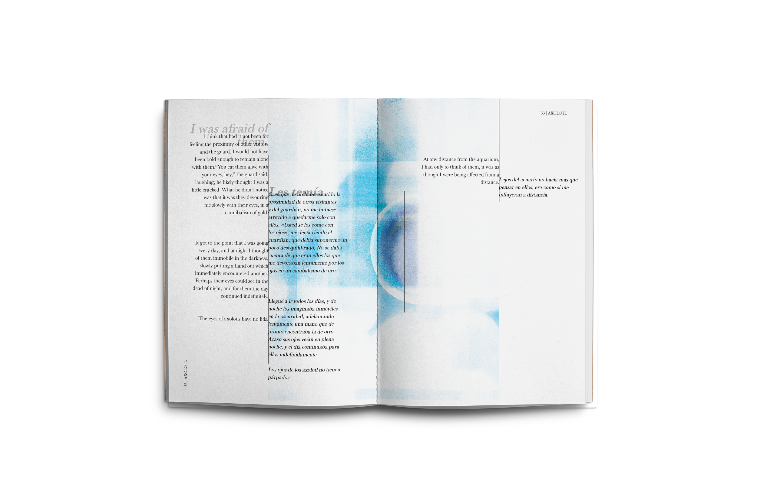
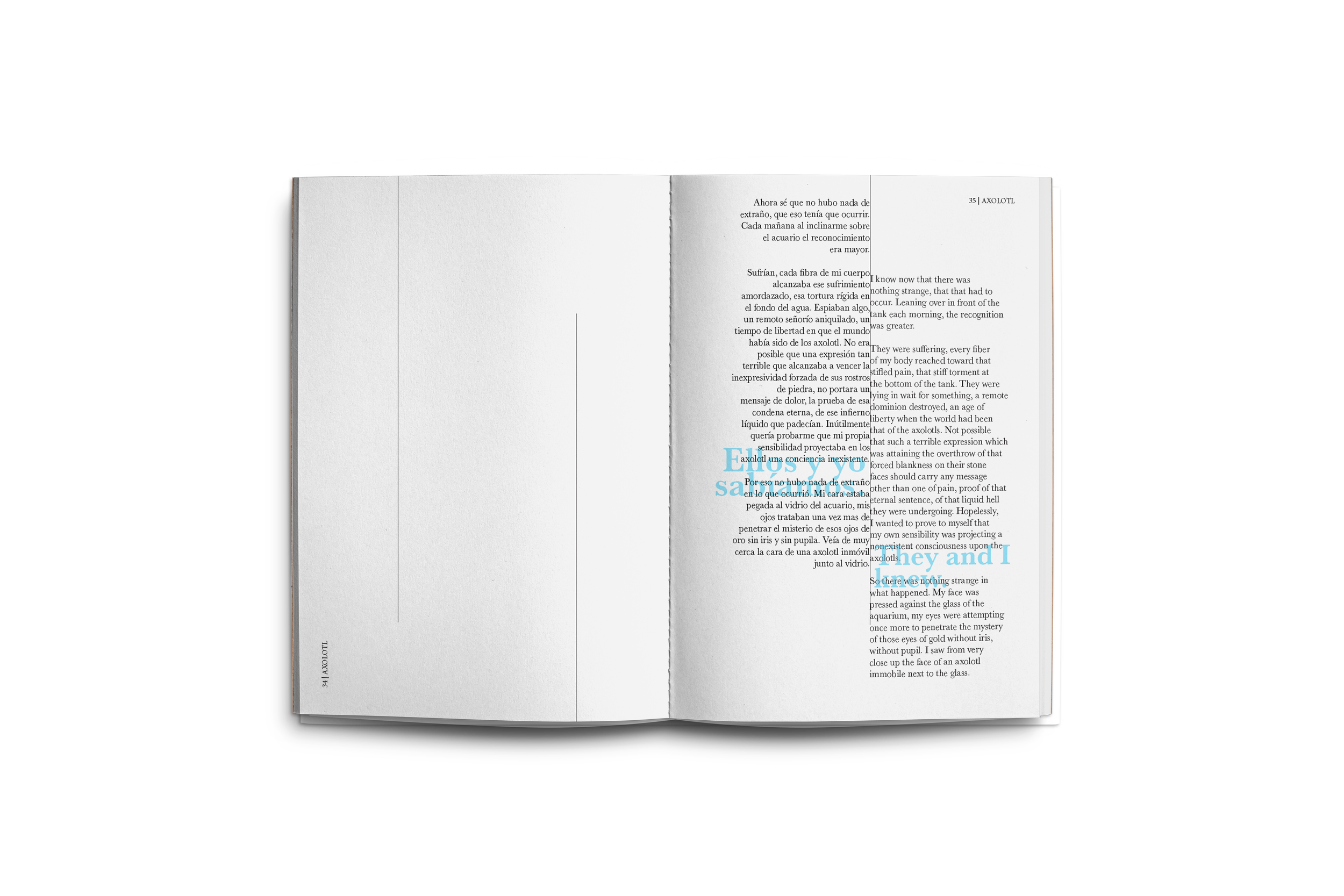
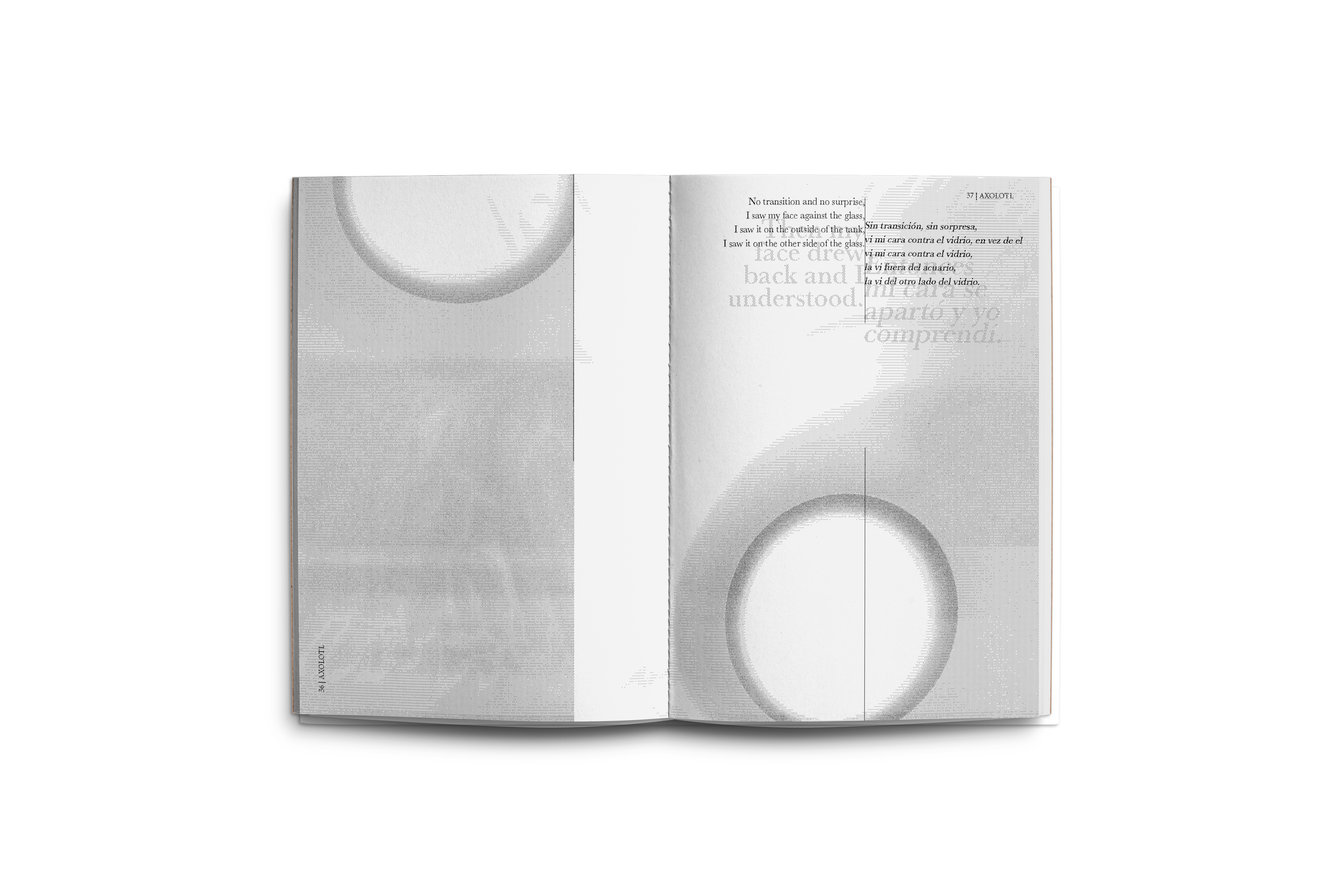
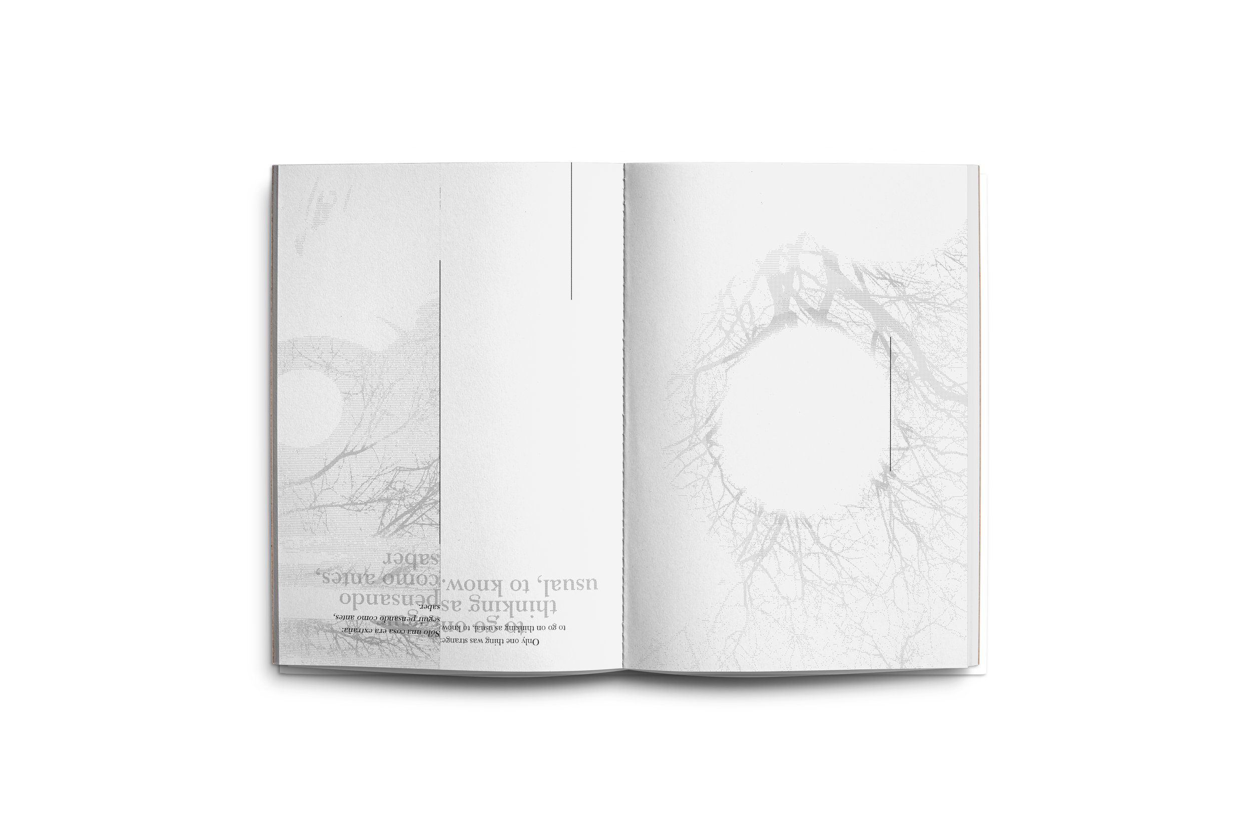
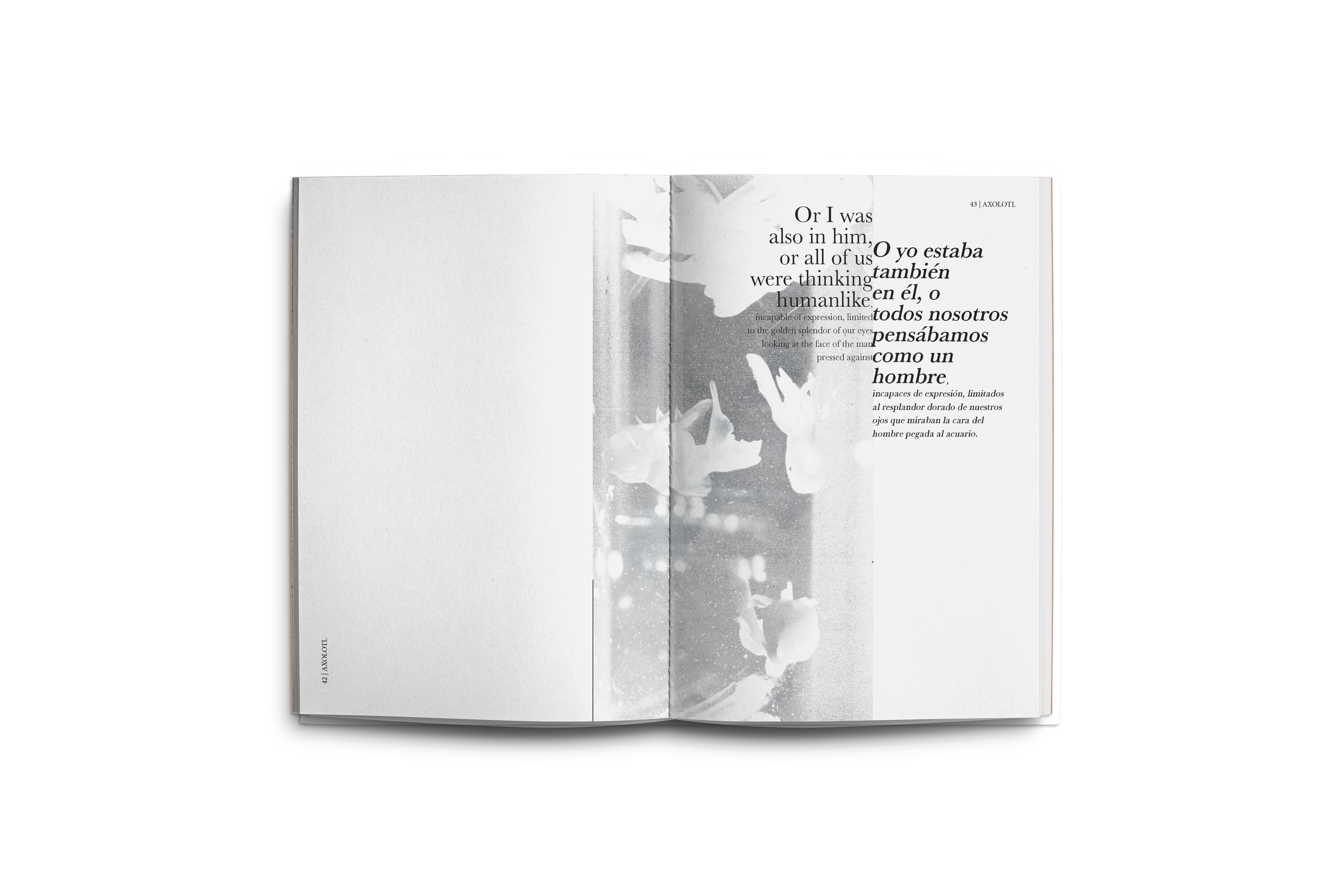
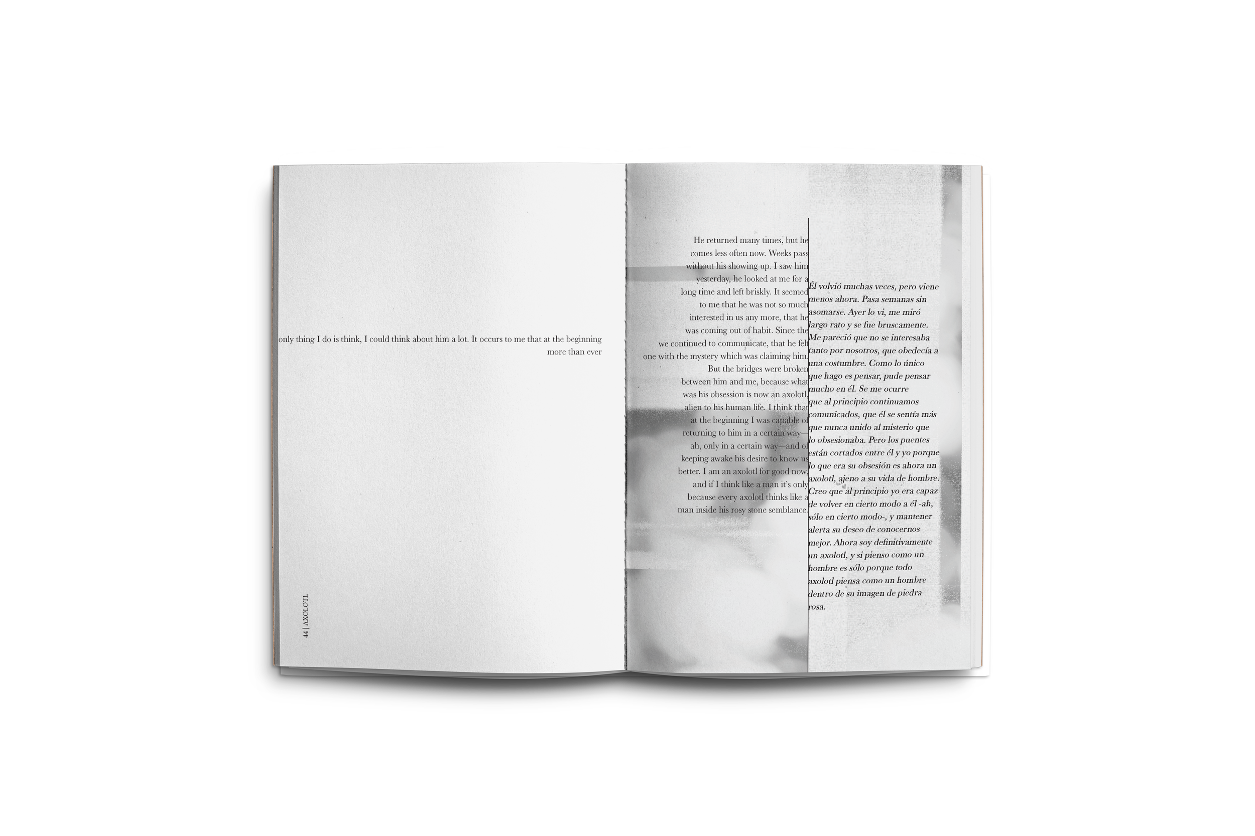
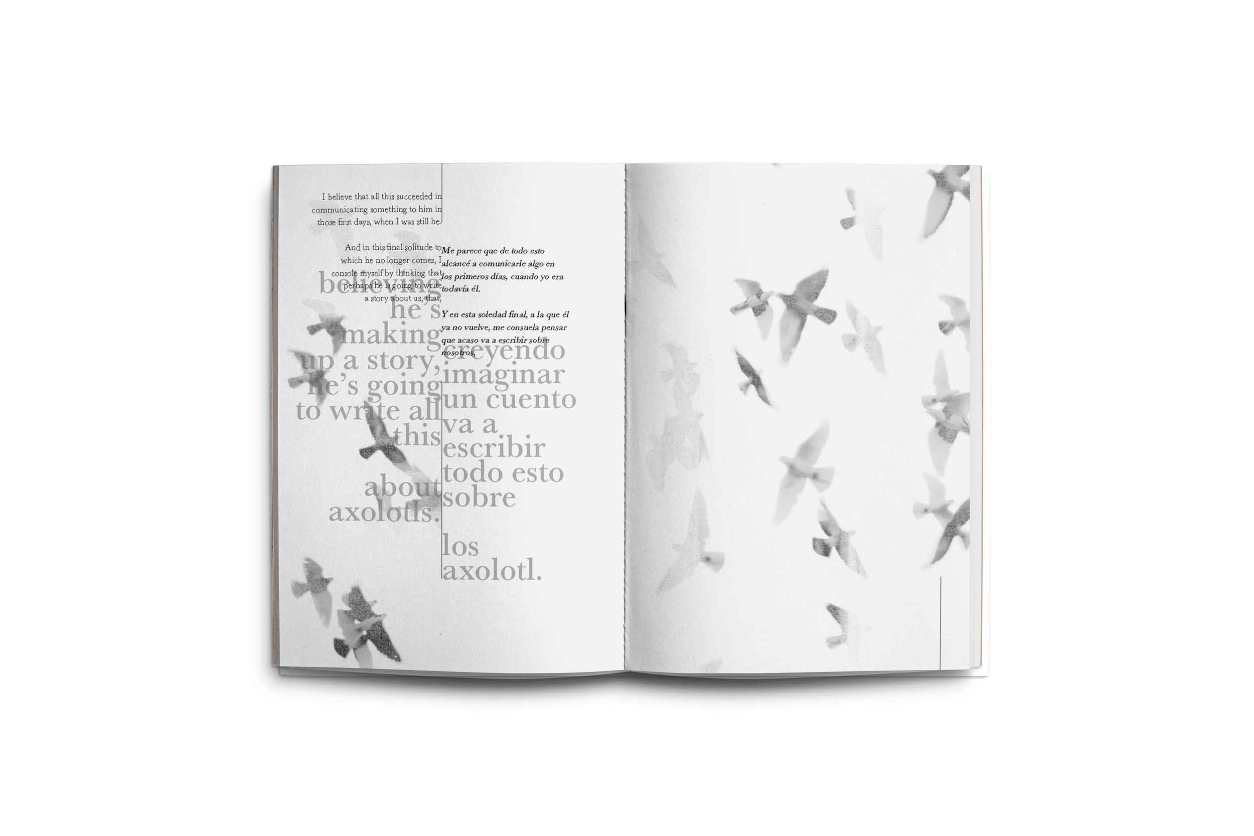
This piece explores foreshadowing as a central design element. By mirroring the tone and pacing of the narration, the visuals are in rhythm with the story while continually hinting at its conclusion.
Color is used with intention, providing subtle cues that shape atmosphere and define shifting environments, at times contrasting the narration, and at others directly reinforcing it.
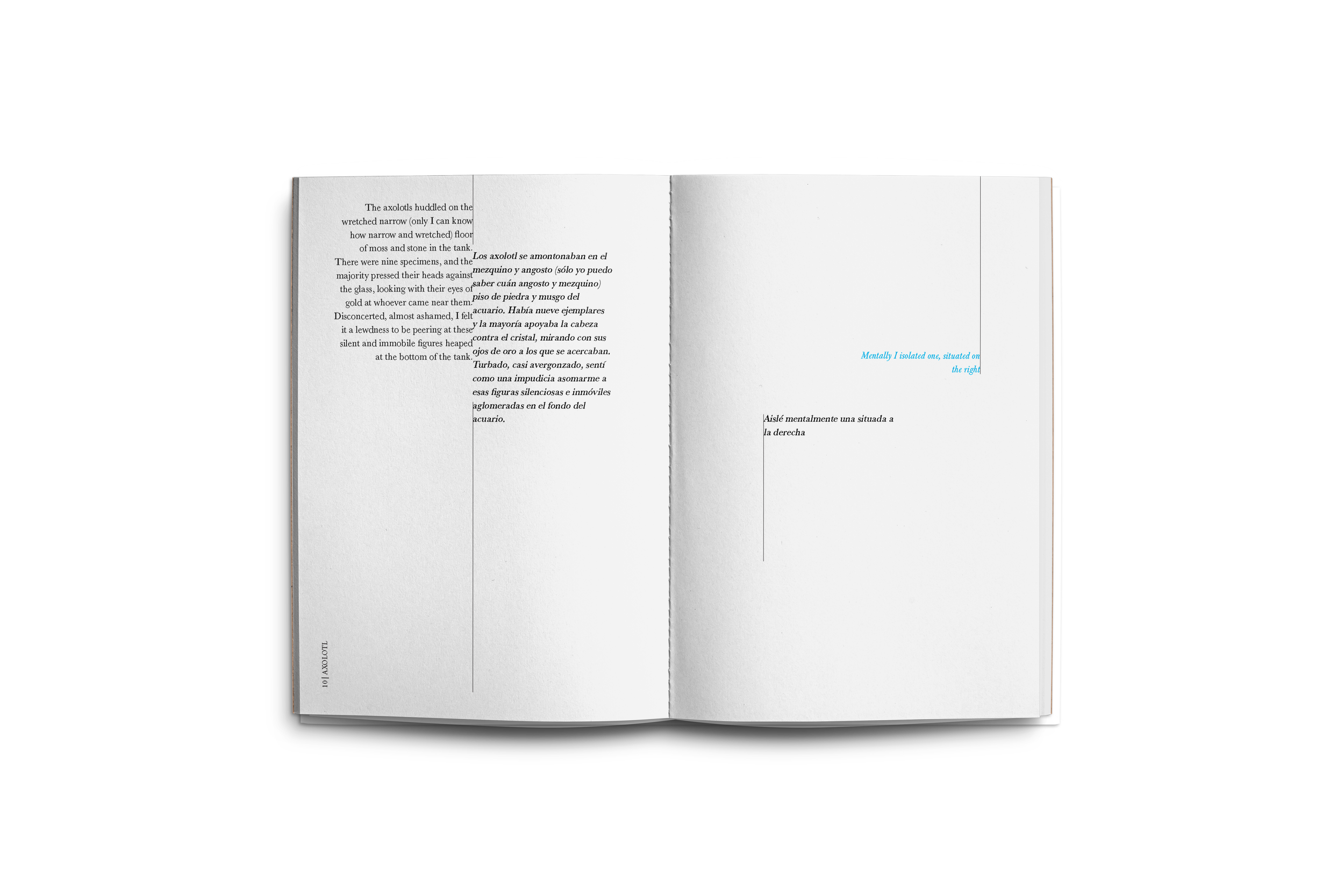
The typographic system integrates both English and Spanish in a way that unifies the two languages without disrupting readability, creating a seamless experience for either audience. Additionally, varied typographic treatments are used to highlight key text, reinforcing the theme of foreshadowing throughout the piece.


“House Taken Over”
by Julio Cortázar
For this second piece, the same typographic system is used while the image treatment shifts to enhance the story’s eerie, mysterious tone.
Color is used to support the suggestion of a “presence” following the protagonist, adding a subtle layer of narrative tension.
The graphic imagery evolves from gray into a black, texture, visually suggesting a gradual takeover. Pacing is also carefully considered, allowing these visual changes to unfold in a way that reinforces the progression of the story.